
Apps Catalog Redesign
Redesigned how 10M+ Creative Cloud members discover and purchase apps - replacing a static, one-size-fits-all catalog with an entitlement-aware, content-first experience that drove $20M+ projected revenue from the first release.
Product Strategy | Information Architecture | Monetization | System Design | Visual Redesign
Company Adobe Inc.
My Role Lead UX and UI Designer - sole designer across 4 consecutive releases; Project Management - managed timelines and stakeholder accountability
Timeline 2023-2025
Team Product Management, Engineering, Content Strategy, Growth design, Design research
Impact $20M+ projected annual revenue from 1st milestone release · 22.2% increase in Buy CTR · 51% lift in web app referrals · North star roadmap defining future milestones
Project Overview
Adobe's app catalog is the primary surface where Creative Cloud members discover, manage, and purchase apps - it’s bread and butter - but it wasn't working.
Banner blindness, platform-siloed navigation, and pricing buried on marketing pages meant users couldn't find what they needed, and Adobe was losing conversions.
The catalog treated every user identically. The same static grid, regardless of plan, installed apps, or membership history.
I led UX and UI across four consecutive releases to fix this - first rebuilding the foundation so the catalog could function, then defining what it could become.
My Role
I owned end-to-end UX across four consecutive releases of Creative Cloud's primary app acquisition surface - from strategic IA decisions through high-fidelity specs and engineering handoff
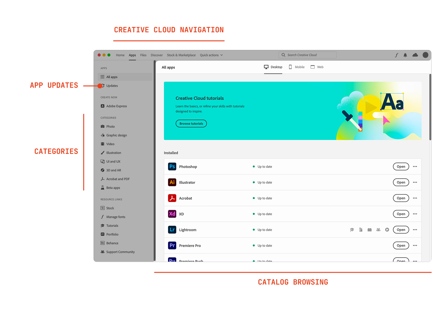
I redesigned the catalog's information architecture, replacing a legacy left-rail navigation model with a content-first layout optimized for vertical discovery - directly addressing scroll behavior research had already identified as the dominant user pattern.
I designed a platform-agnostic, entitlement-aware catalog that surfaced the right apps for each user's plan, contributing to $20M+ in projected annual revenue and a 51% lift in web app referrals.
I also maintained product continuity through significant org changes, keeping four releases on track through extended periods.
I defined the North Star concept that shaped the subsequent roadmap - identifying pricing integration, personalized category pages, and PDP redesign as the next three milestones.
This project changed how I think about design leadership: from quality of output to quality of process.
Project Outcome
The rollout of Apps (Milestone 1) delivered $20M+ in projected annual revenue, driven by a 22.2% increase in Buy CTR and a 51% lift in web app referrals - directly solving the hidden web apps problem that had persisted for years.
The North Star concept and roadmap, built on the validated foundation of Milestone 1, charted a clearer path to conversion across the full Creative Cloud member base - treating personalization and catalog coherence as revenue levers. Integrated pricing, in-context plan information, and richer category pages are in active testing and development.
SHIPPED AND MEASURED
Milestone 1 - Rebuilding the foundation
Flat catalog list over tabbed platform navigation
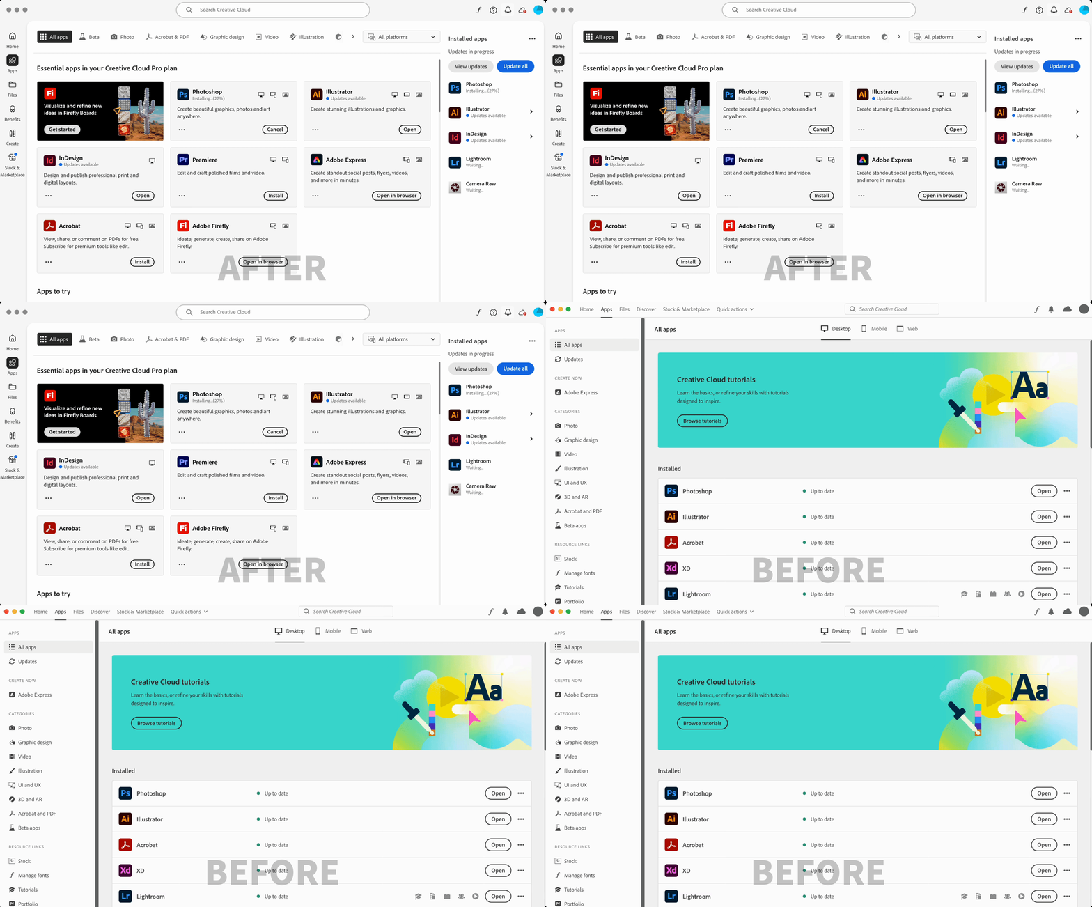
The tabbed structure separating desktop, web, and mobile apps was architecturally logical but behaviorally broken. Over 60% of users never switched tabs -meaning web and mobile apps were effectively invisible. Collapsing everything into a single entitlement-aware list meant users saw apps relevant to their plan by default, without needing to know what to look for, moving one step closer to personalization. Web app awareness increased significantly as a direct result.
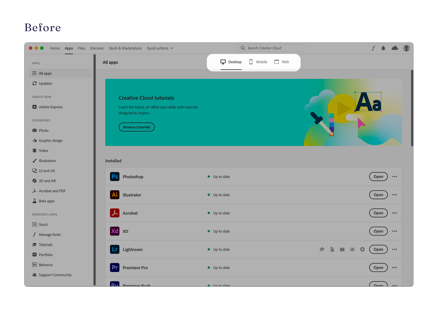
BEFORE
Tabbed by platform; Desktop selected by default
60%+ of users never switched tabs - web apps are invisible
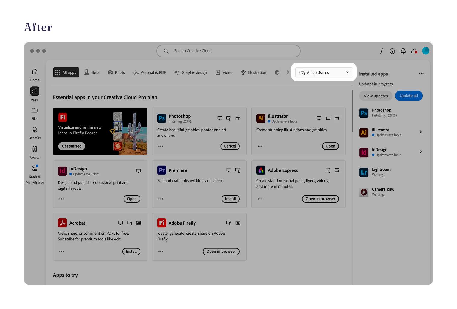
AFTER
Flat, entitlement-aware list; all platforms shown inline
51% lift in web app referrals post-launch
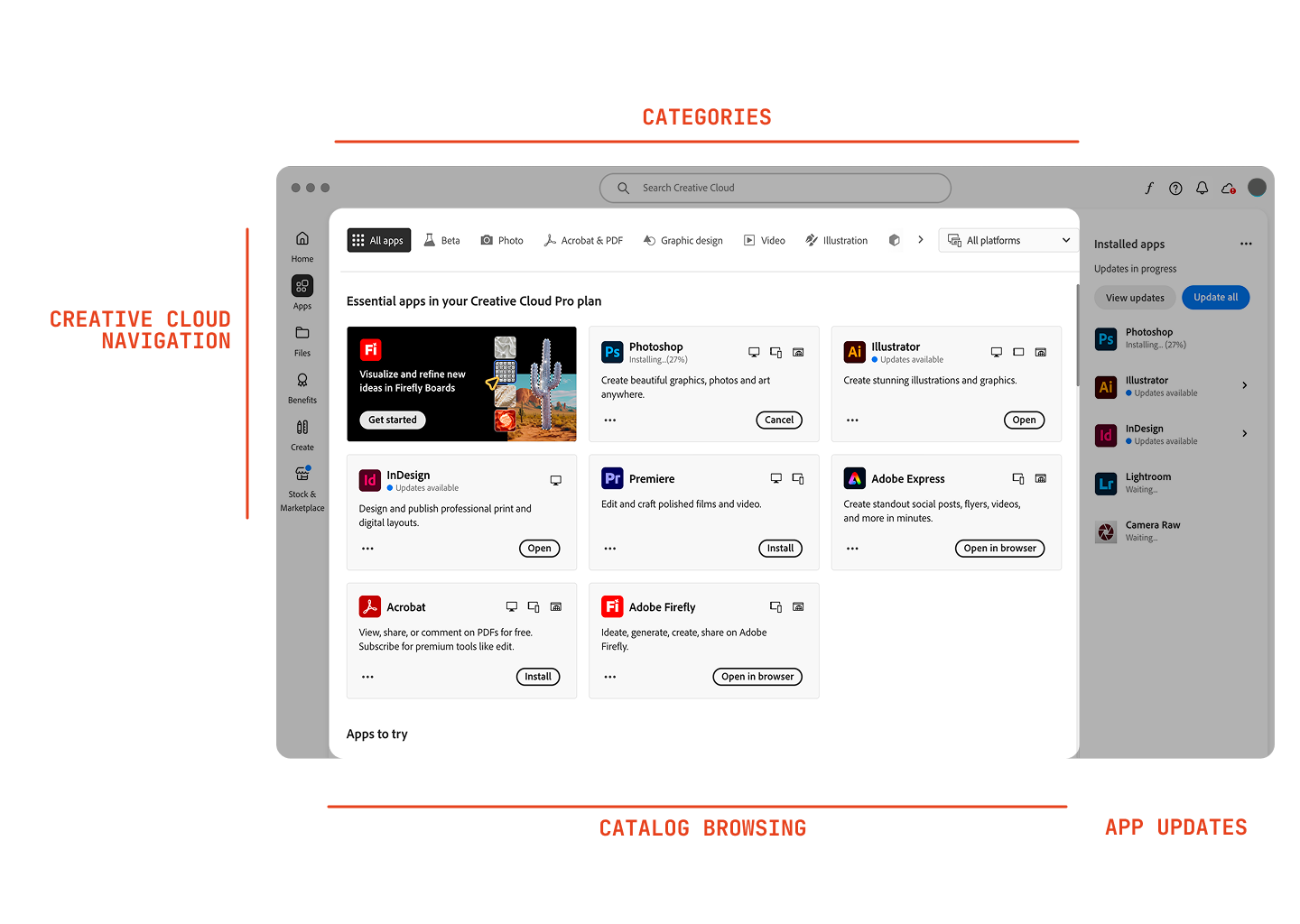
Removing the left rail entirely in favor of a content-first layout
Research confirmed users were scrolling the main content area - not navigating the left rail, which was taking up roughly 25% of the viewport. I removed it entirely and introduced a bifurcated layout: more space for Browsing & Discovery on the left, Utility & Updates on the right. The result matched actual user behavior rather than assumed navigation patterns, and gave the catalog room to surface more of what members were already paying for.
BEFORE
Wide installed apps list dominates above the fold
Static layout
AFTER
Discovery content elevated; installed apps in a dedicated panel
Programmable content blades for future personalization
Contextual growth cards over large promotional banners
Large banners were generating banner blindness and frustrating users trying to find an app. Replacing them with contextual growth cards placed inline within the catalog grid preserved cross-sell opportunities while reducing friction. The cards read as recommendations rather than interruptions.
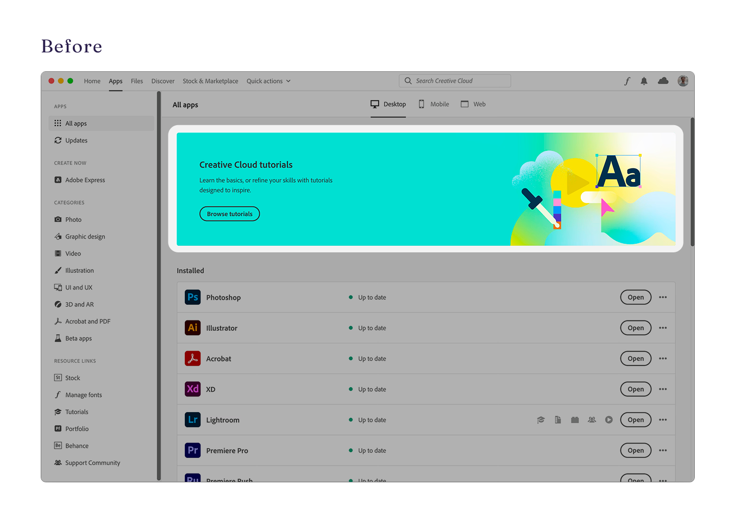
BEFORE - Large banners causing banner blindness
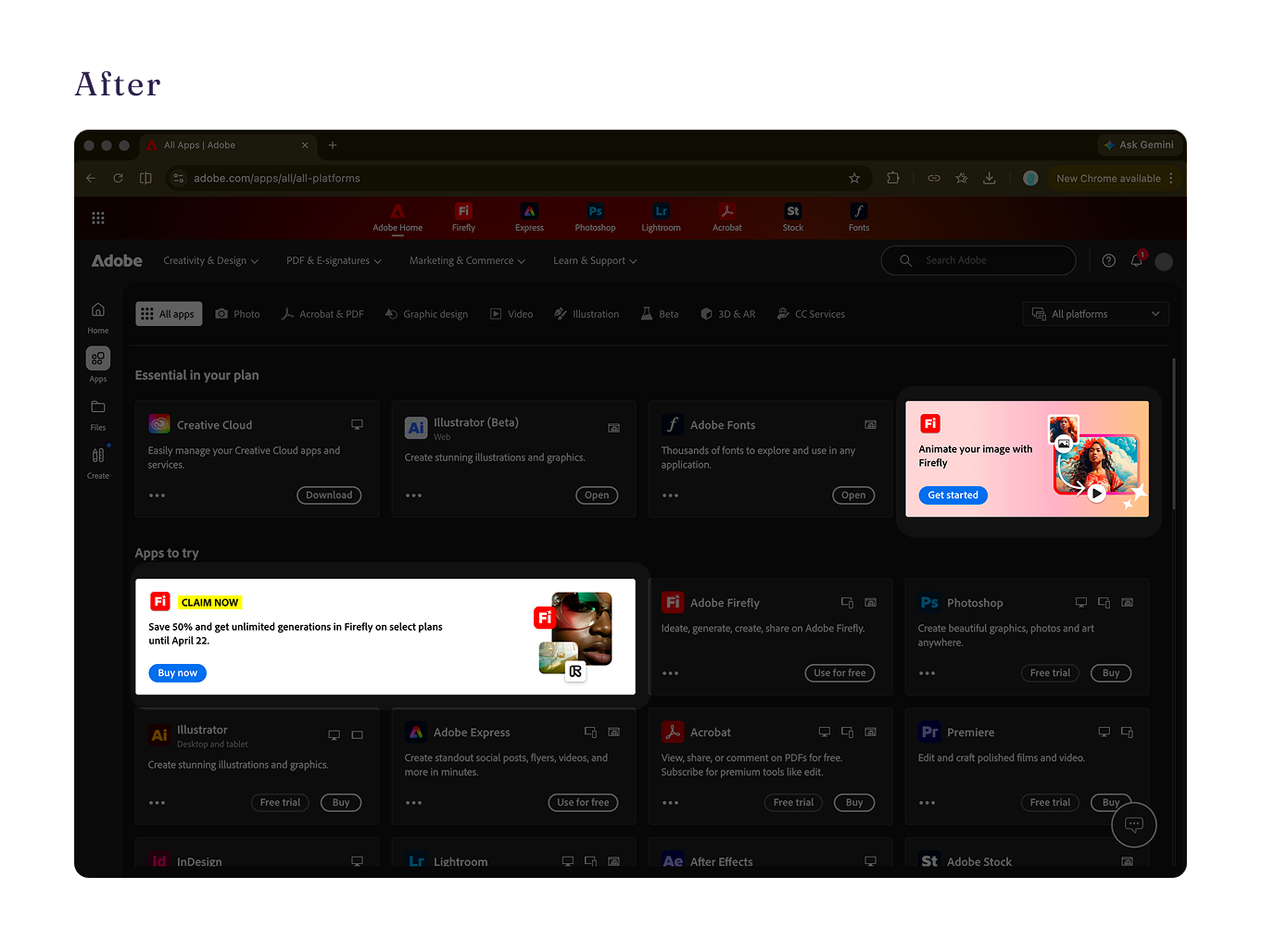
AFTER - Integrated cards
BUILT TO SCALE
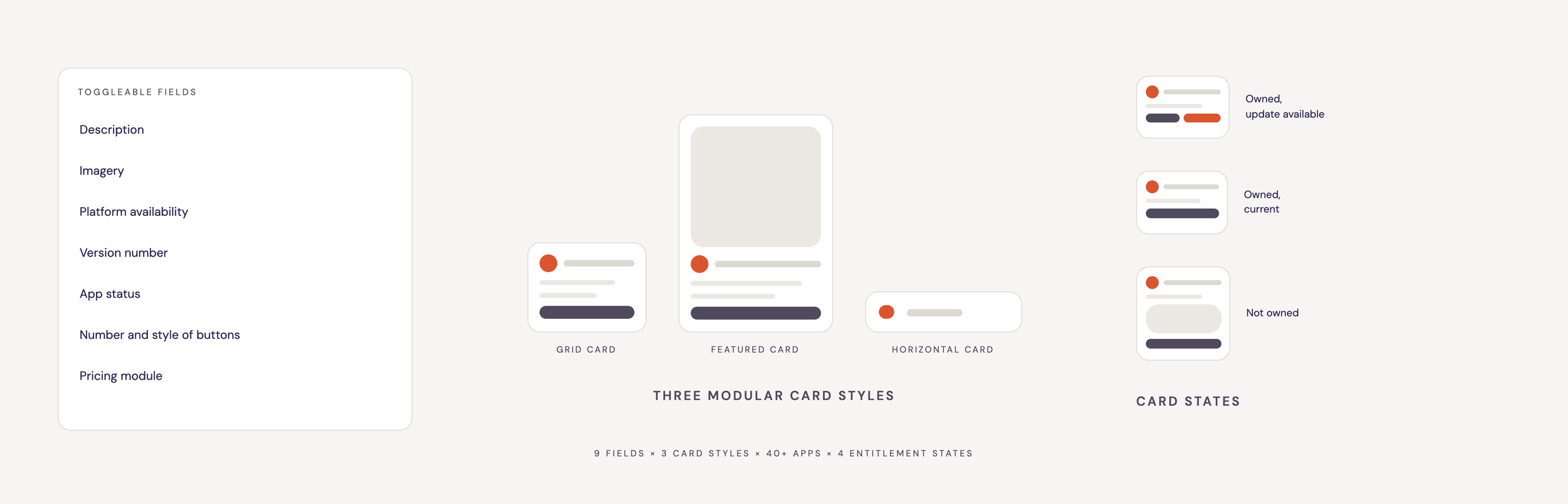
The Underlying System - handling the complexity
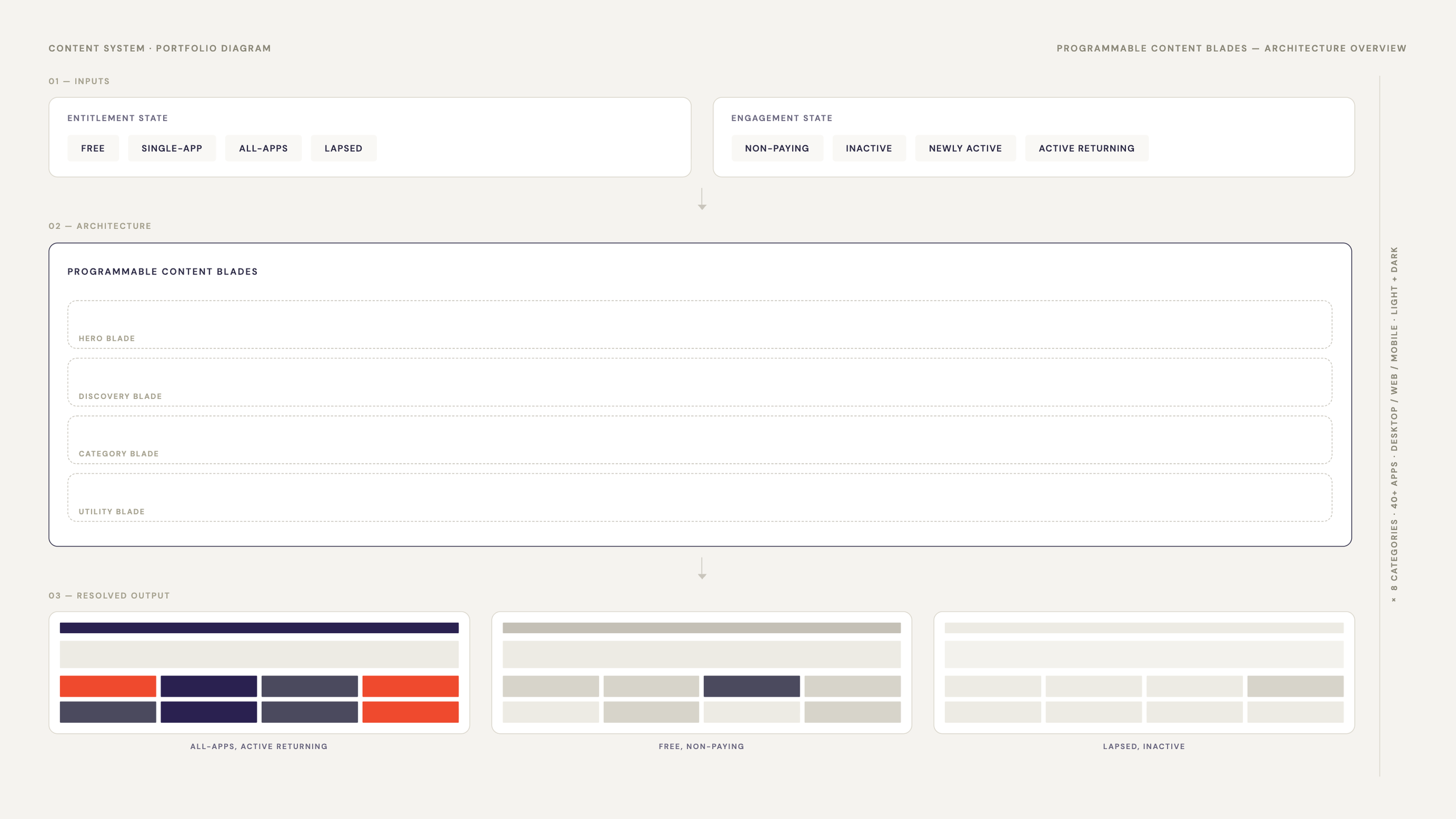
This catalog isn't just one screen. It needed a framework that can handle all the layers of complexity.
4 entitlement states - free members, single-app plan members, all-apps plan members, lapsed members
4 engagement states - non-paying, inactive, newly active, active returning
8 categories - all apps, your apps, photo, video, illustration, document, 3D, beta
40+ apps - with varying availability on desktop, web, and mobile
2 surfaces - responsive designs for desktop and web breakpoints
2 themes - light and dark
Programmable content blades let a single layout resolve differently per member state - the blade defines position, hierarchy, and behavior; entitlement and engagement data determine what fills it. Growth cards, category modules, and app groupings all compose into the same slots. One framework for a surface that stays extensible as new states and apps arrive.
The pricing component and category page architecture you’ll see below were built as independent pieces of this framework. They are composable into the catalog without depending on the shell around them.
DEFINED THE ROADMAP
North Star Concept
A catalog that surfaces the next best app for every member, based on skill level and creative history
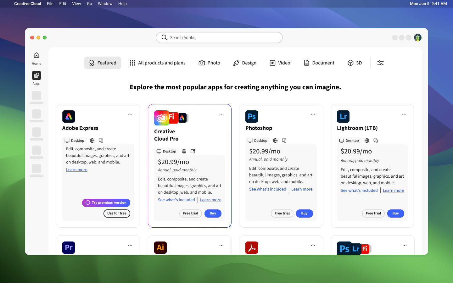
EXPLORATION. Pricing integration derived from this work.
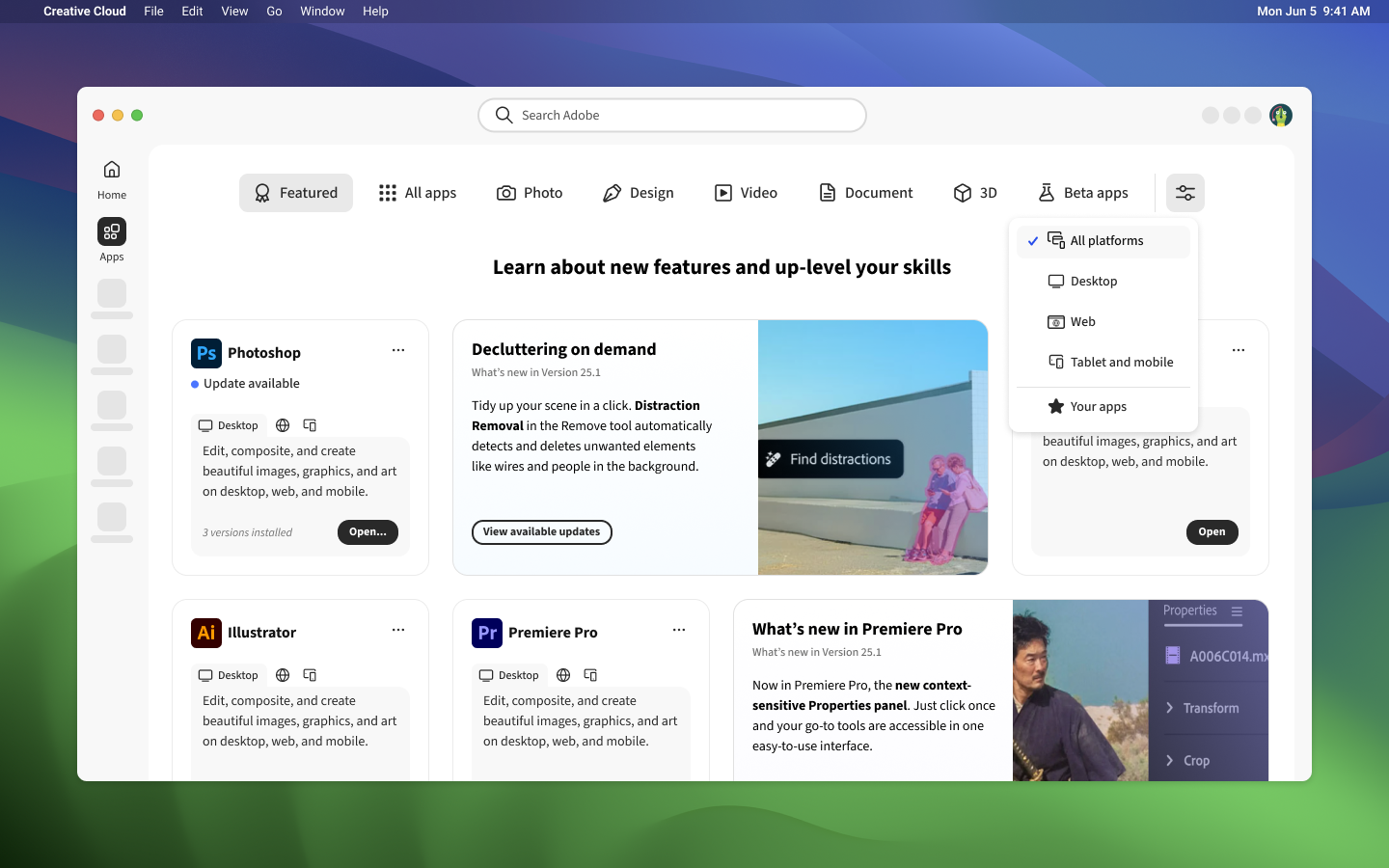
EXPLORATION. Category page design derived from this work.
The North Star concept - a catalog that surfaces the next best app for every member based on skill level and creative history - didn't reach full cross-functional alignment during this engagement.
The pricing integration, in-context plan view, and editorial category pages, now in active development, were all defined in this vision work. The pricing integration, in-context plan view, and editorial category pages were all defined in this vision work. The PDP redesign and app update experience follow the same foundation.
DESIGNED AND TESTED
Milestone 2 - Pricing integration & UI improvements
60% of web users were leaving the catalog to find pricing - available only on Adobe's marketing pages. That navigational gap was directly costing conversions.
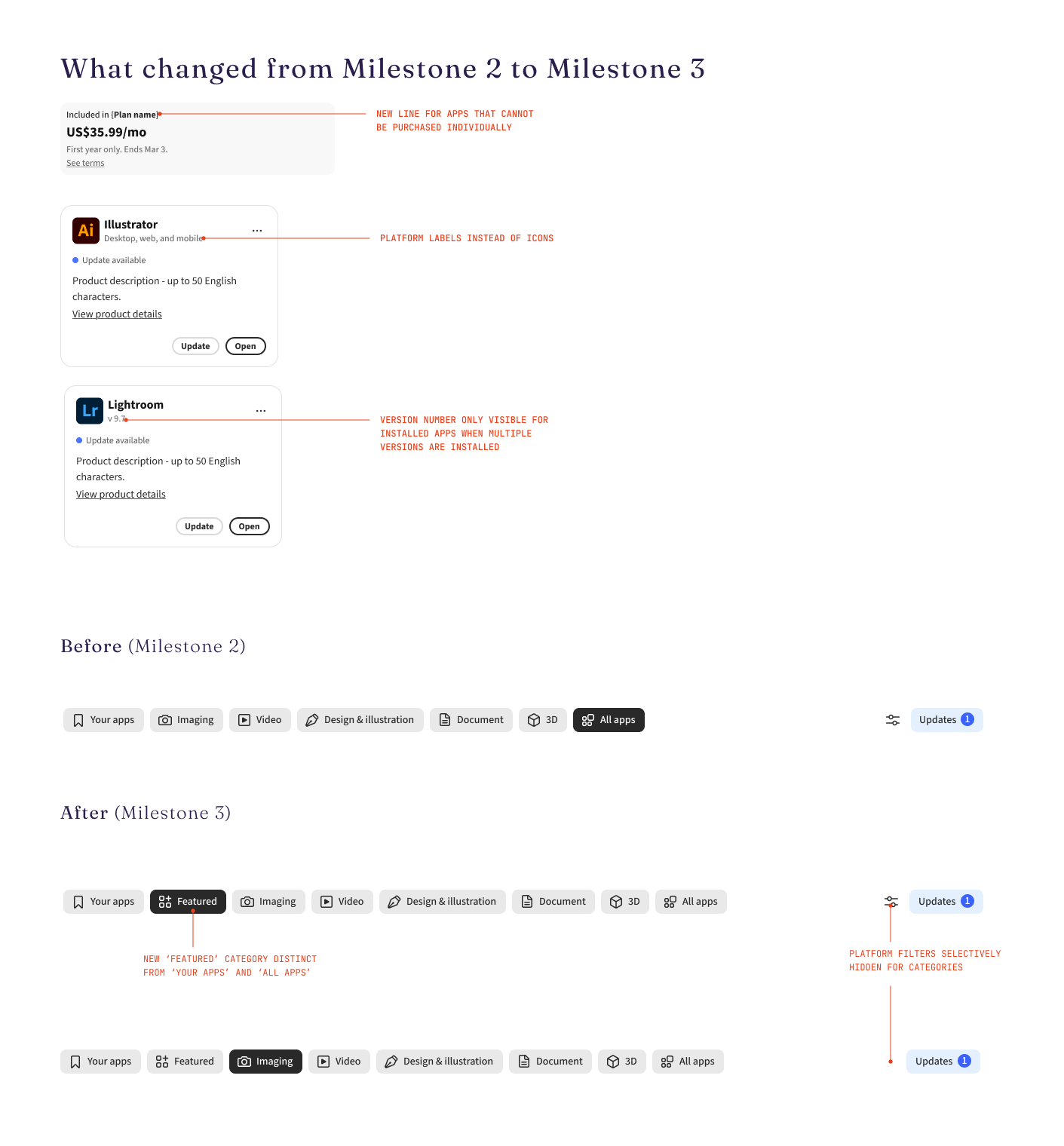
I redesigned the experience to surface pricing at the decision point: on app cards, on Product Detail Pages, and within an in-context Plans view. Users could evaluate, compare, and act without leaving the catalog.
Currently in testing.
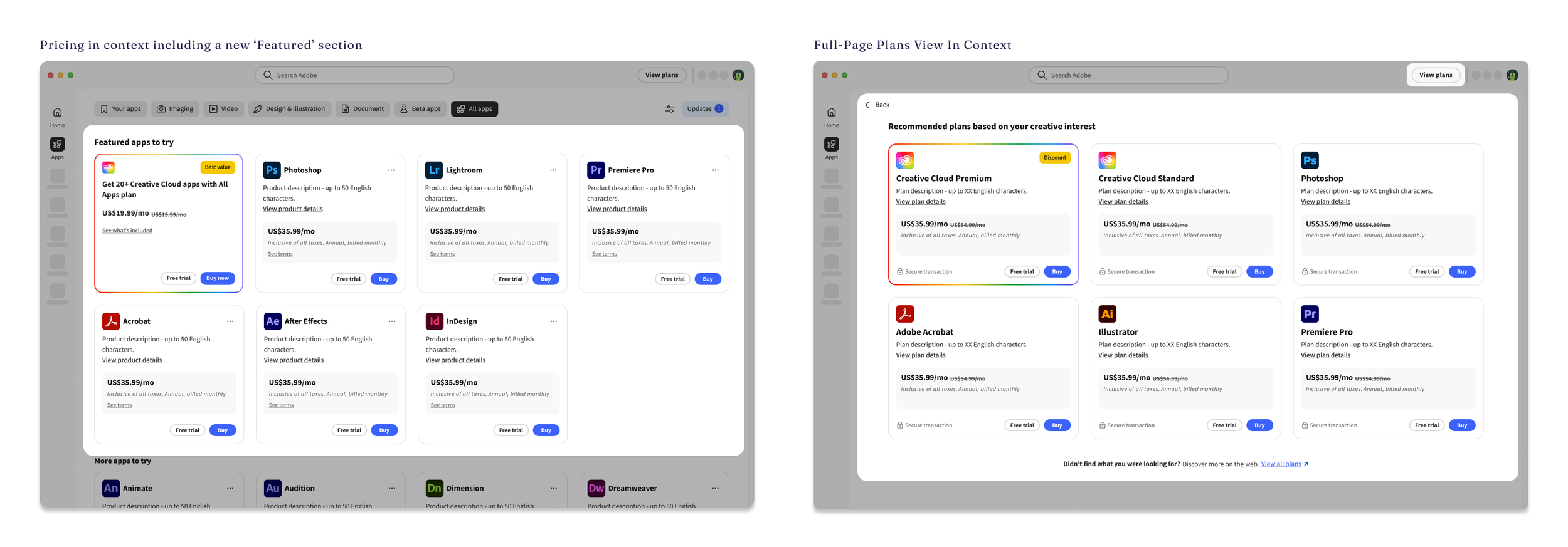
Key changes:
Pricing surfaced inline on app cards and PDPs
Focused "Popular Plans" modal to streamline plan selection
New "Your Apps" category for entitled users; "Featured" category for upsell
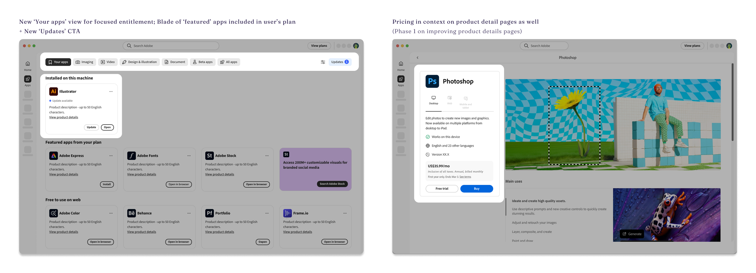
Key changes:
Dynamic Updates button in the header, replacing the installed apps management panel (data showed most users visit to update apps, but the priority shifted toward new user activation)
Visual refresh to Spectrum 2, Adobe's current design system
Hierarchy and layout improvements to card content and header
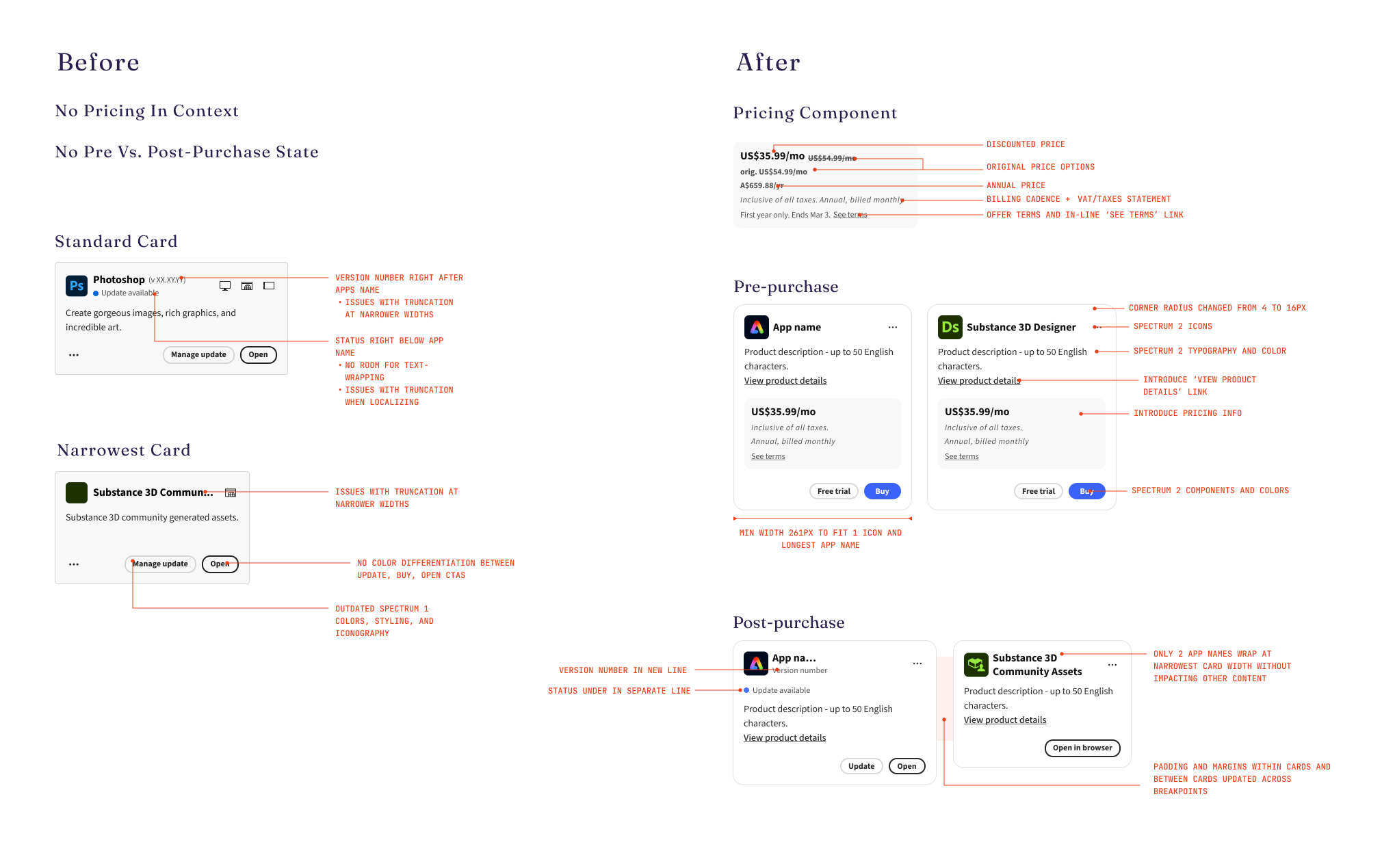
Changes to the card styling and content
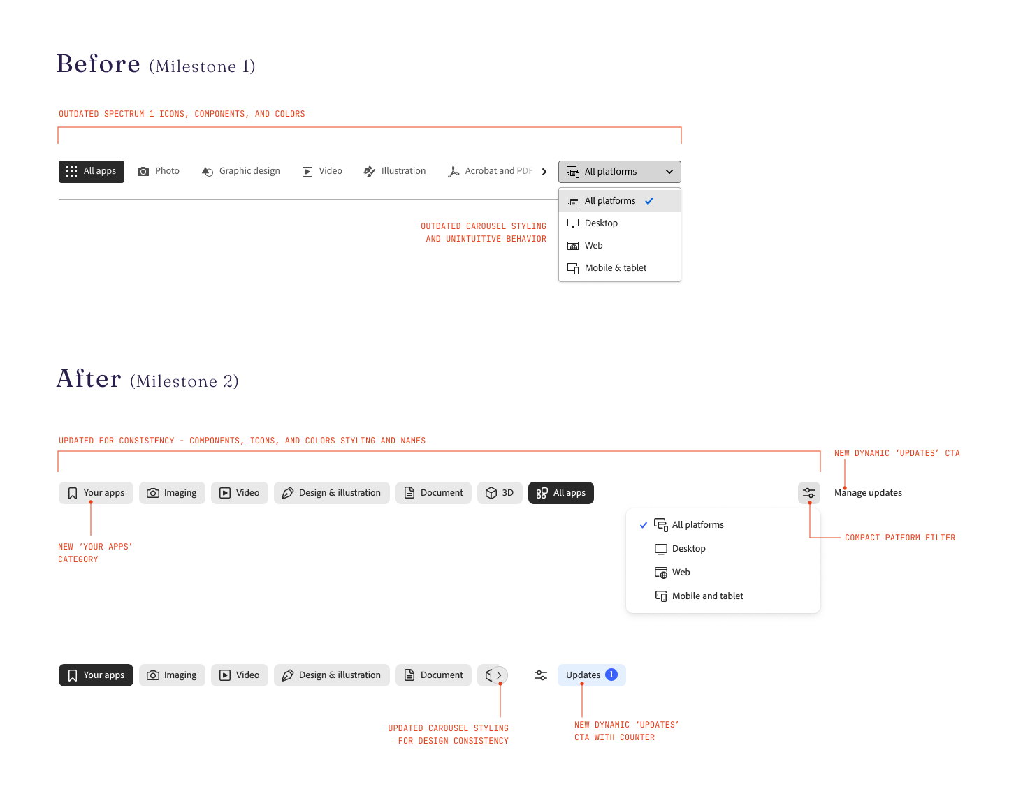
Changes to the header styling, UX, and content
DESIGNED AND TESTED
Milestone 3 - Categories as decision surfaces
Legacy comparison tables had proven value at Adobe - helping users evaluate tools and decide where to start. The Milestone 1 and 2 rebuilds required removing them, but restoring static, outdated tables wasn't the answer.
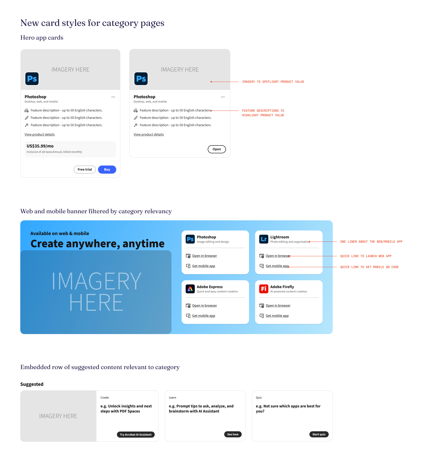
I reframed the concept as feature highlight cards: a content-first format built for editorial programming, personalization, and longevity.
Category pages sit at the intersection of UX, content strategy, product marketing, and display logic. With this redesign, they stop being filtered lists and start working as decision surfaces - a member can compare capability, understand cost, and act without leaving the page.
Suggested workflows and learning content extend that further, giving experienced members a reason to explore adjacent apps rather than only the one they came for. The result turns a navigational dead end into an acquisition surface.
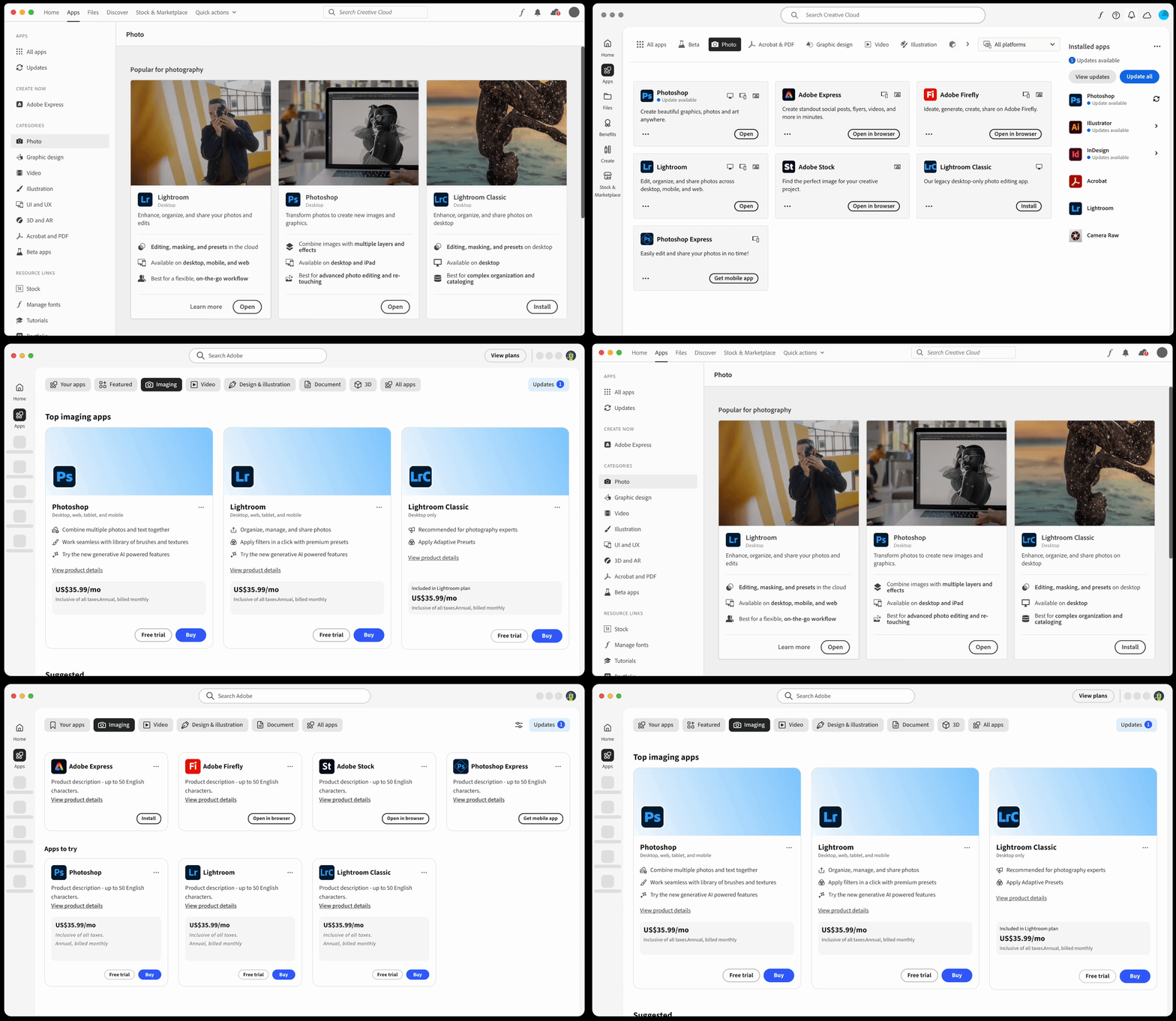
Progression from Legacy Category pages to Milestone 1 -> Milestone 2 -> Milestone 3 (reintroducing better category pages)
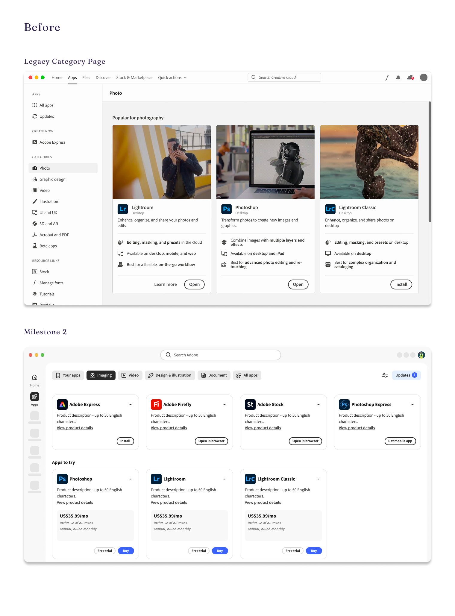
BEFORE
simple grid of filtered apps - no hierarchy, no story
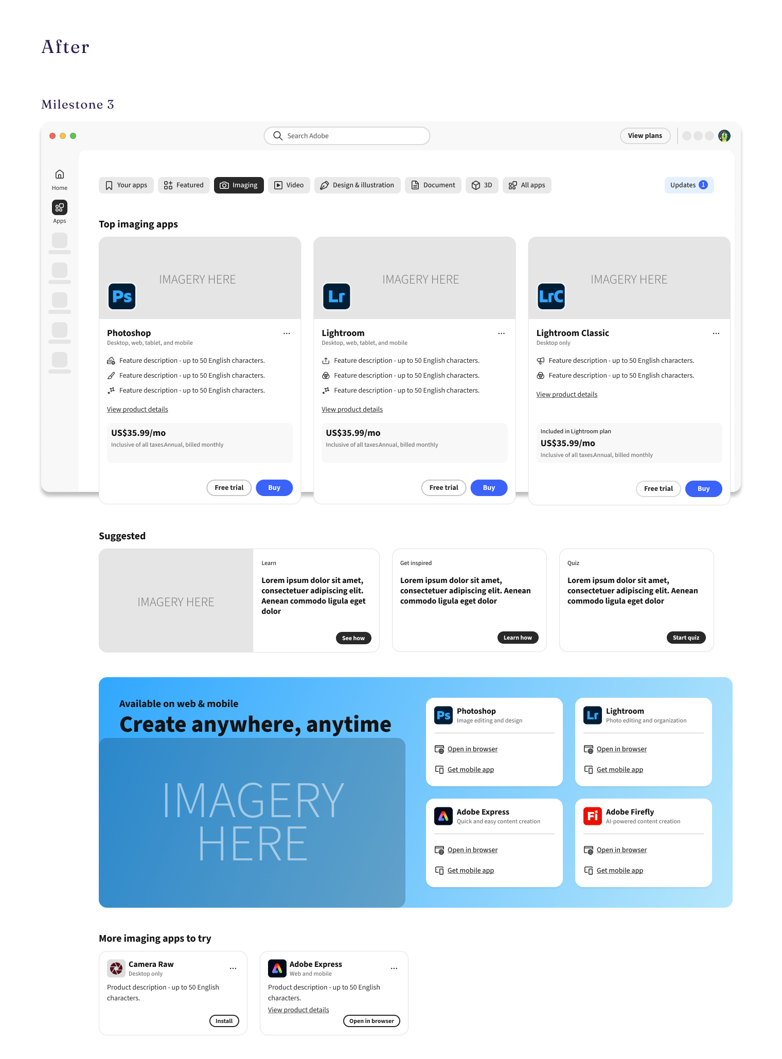
AFTER
Feature highlight cards replace the static comparison tables
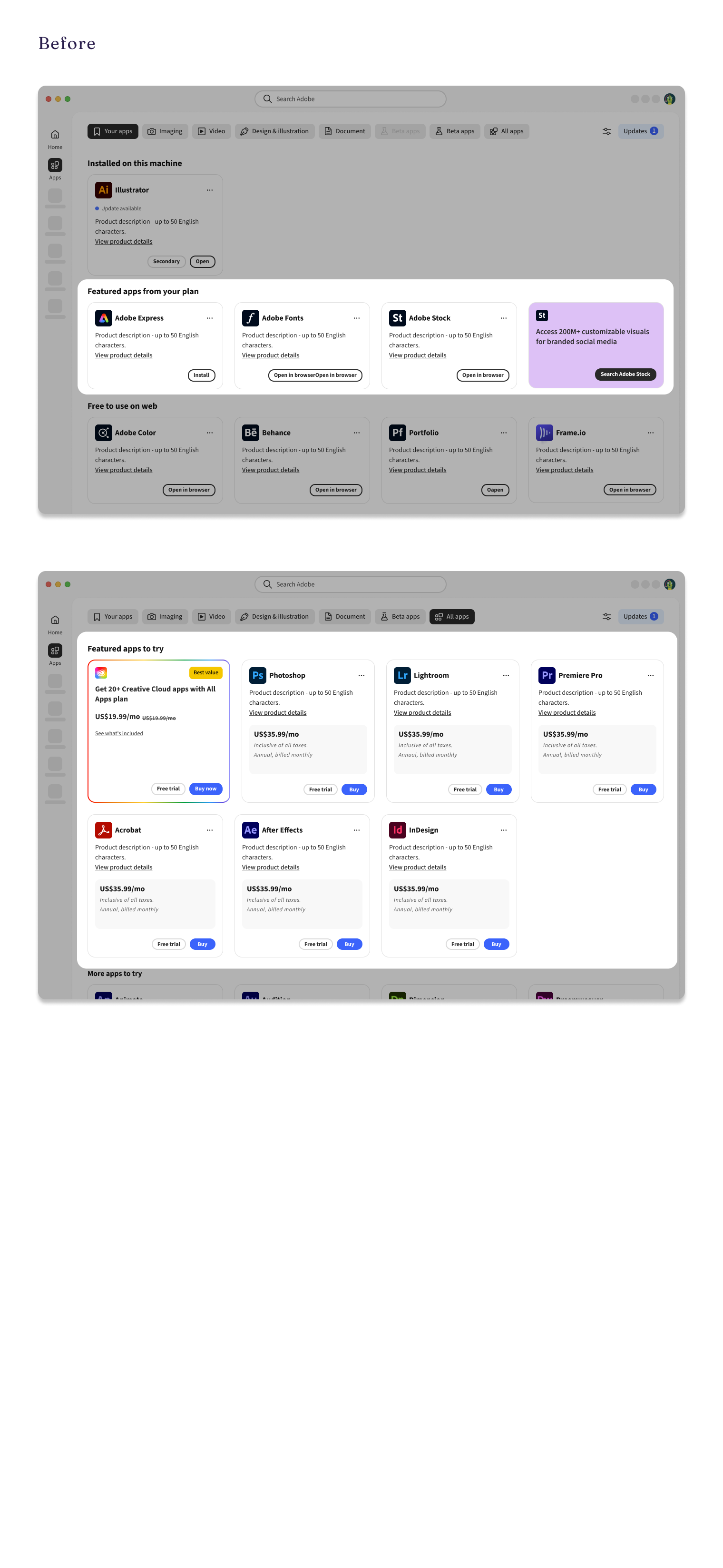
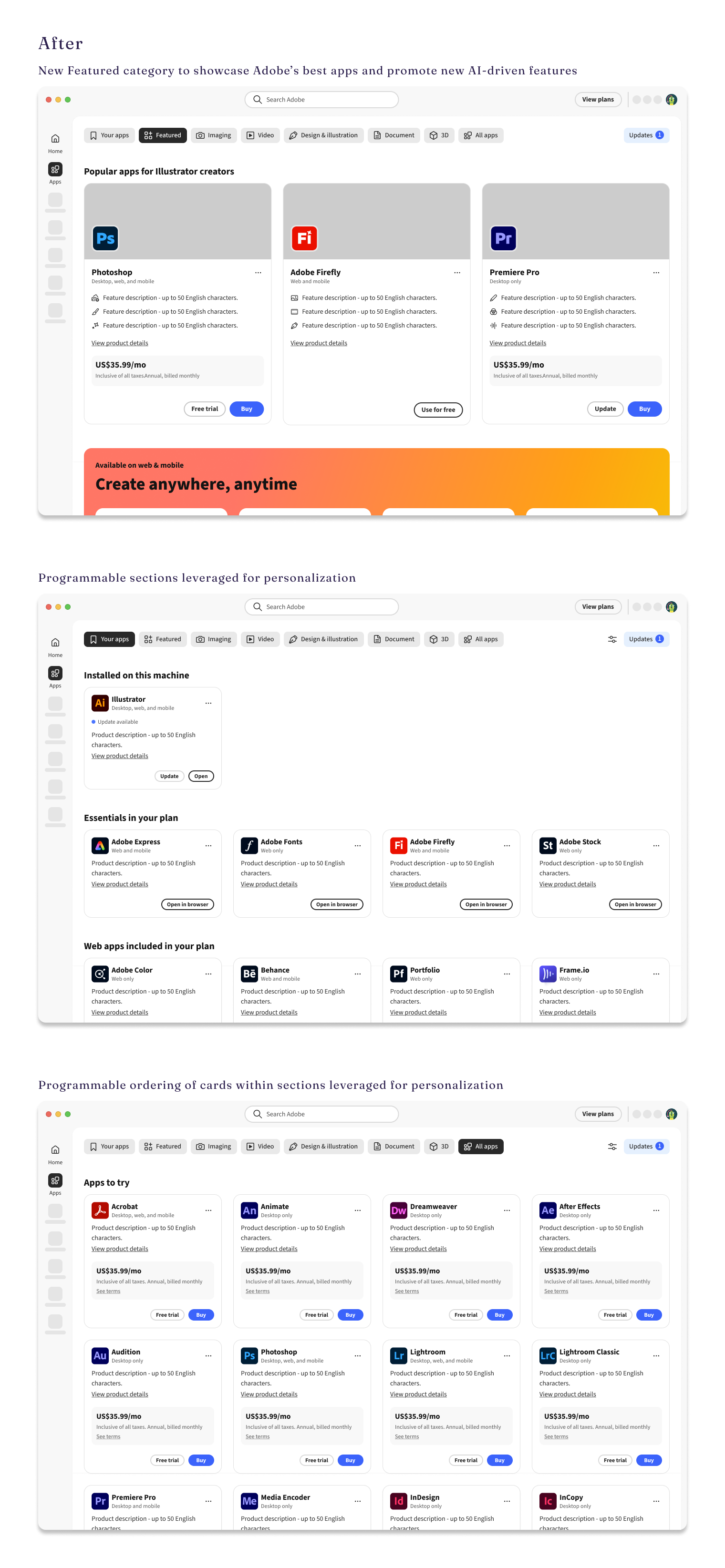
Learnings
Validation debt
Only Milestone 1 was built on known user pain points. Everything after was a hypothesis. That put design in the position of carrying alignment, and even though the North Star worked as a centering artifact, it didn't produce the commitment it deserved. Alignment isn't the same as validation.
Design can move fast. What slows it down is when the hypothesis hasn't been tested cheaply before the expensive build begins.
Alignment is design work
Four releases, one designer, and repeated partner turnover meant no one else was carrying continuity between releases. Design quality alone doesn’t move things forward - the process work does.
Weekly syncs, a documented decision log, and explorations delivered ahead of engineering are now my default, because I learned what their absence costs.
Working without direct authority sharpened one skill above others: knowing when to push, when to absorb, and when to name a problem before it derails something downstream.

Scope is a design decision
Milestone 3 timeline expanded because content dependencies weren't accounted for in the original plan and scope.
Advocating for a realistic scope IS quality control. Challenging an underscoped brief at the brief stage is part of the design work.

Visibility and voice are part of the job
Heads-down delivery isn’t enough in a complex org. Decisions get made in rooms you're not in, and get misread in those rooms.
Short written updates, rationale documented at the point of decision, and explorations shared before they're finished are now an active practice. The work argues for itself when I'm not there to argue for it.

Substance is a design input
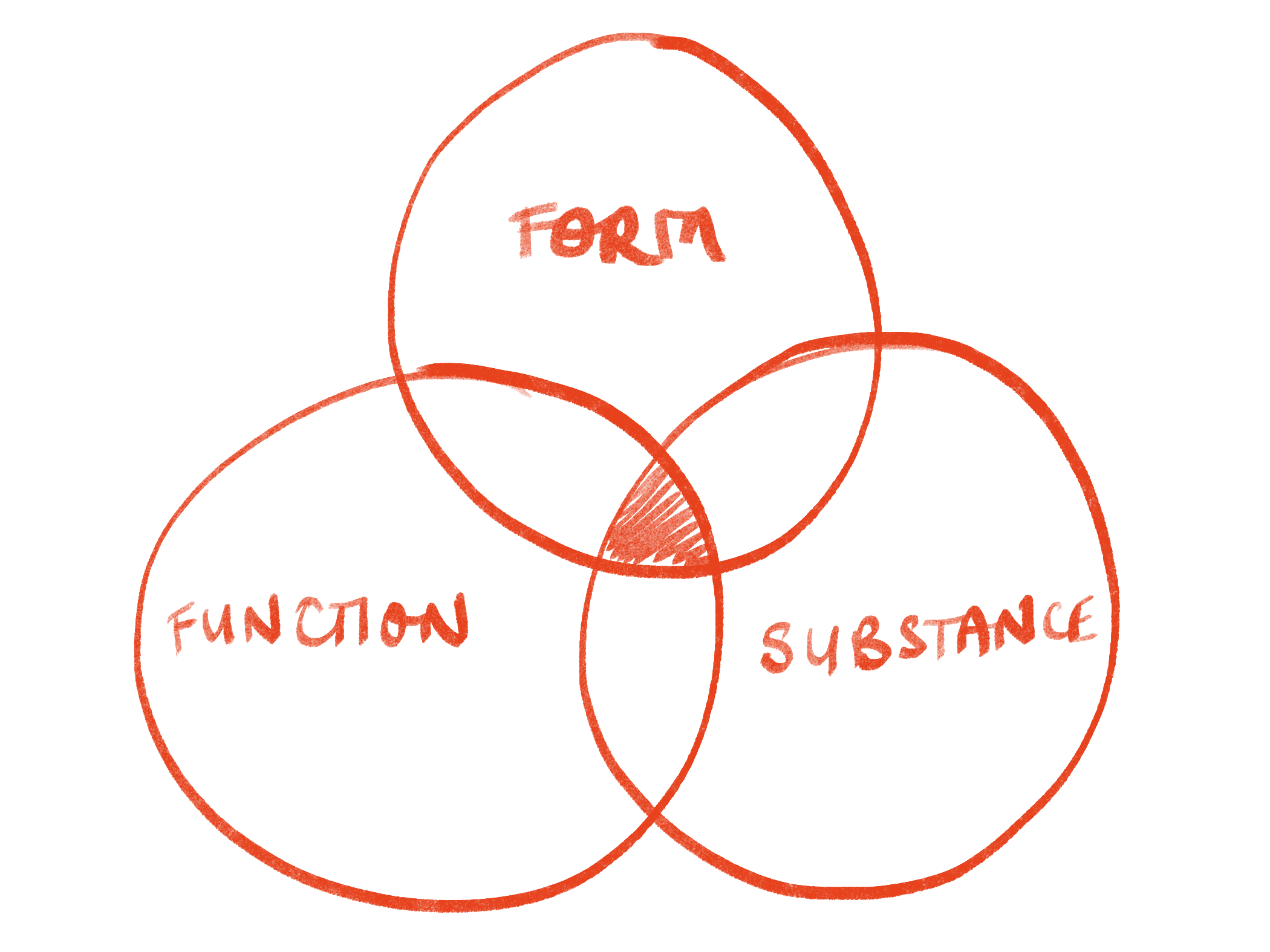
Function is what the surface does. Form is how it's built and how it holds up. Substance is what fills it - and it's the one that gets deferred, because it belongs to content strategy, product marketing, and display logic rather than to design.
Category pages taught me that a content-first surface designed without its content is just an empty layout. I now treat substance as a design input at the brief stage.
Two-plus years. Four releases. I'm proud of what shipped.
What I'd do differently: build the research repository earlier, pull content strategy in at the brief stage, and test the hypothesis cheaply before the expensive build begins.